
Client: Australian Digital Health Agency (ADHA)
Role: Lead Experience Designer
Platform: My Health Record (Practitioner View)
Context & Role
The Australian Digital Health Agency (ADHA) manages the My Health Record (MHR) system, a national digital health platform comprising multiple interfaces, including web portals and APIs, used to access clinical documents created by healthcare practitioners.
People in Australia with a Medicare card can view their records via the MHR website or the my health gov app. Healthcare professionals typically access the same underlying records through their Practice Management Systems (PMS), which integrate directly with the MHR database. Where PMS access is unavailable or insufficient, practitioners can also use a dedicated web-based MHR Practitioner Portal.
The Practitioner View is a clinician-facing interface designed specifically around healthcare workflows and clinical decision-making. It supports both PMS integrations and the standalone Practitioner Portal, ensuring consistent access to MHR data regardless of entry point.
I was the Lead Experience Designer on this initiative. The work was deliberately split into two parallel design streams:
- A practitioner-facing consolidated view, focused on clinical accuracy, decision support, and workflow efficiency
- A patient-facing consolidated view (Health Profile), designed to surface the same underlying information with reduced clinical complexity
I led design strategy and delivery for the Practitioner View while overseeing and guiding designers working on the patient-facing Health Profile, ensuring a shared information model while allowing each interface to respond to its primary users.
The Problem
While the My Health Record system contained a comprehensive set of patient documents, the Practitioner View did not provide a consolidated view of a patient’s conditions.
Clinical information was distributed across multiple screens and tabs, segmented by document type rather than clinical relevance. Practitioners were required to navigate between views covering medications, interventions and procedures, shared health summaries, diagnostic imaging, and pathology reports.
What Was at Risk
If the Practitioner View remained unchanged, clinicians would continue to rely on fragmented information spread across multiple tabs and screens, requiring repeated navigation to assemble a coherent picture of a patient’s history.
This introduced several risks:
- Wasted clinical time due to repeated context switching
- Increased cognitive load under time pressure
- Greater likelihood of oversight where critical information lived in separate parts of the interface
A consolidated view would instead allow clinicians to scan, sort, and filter information in a single continuous screen, reducing friction and supporting faster, more confident decision-making.
Constraints & Complexity
Multi-Stakeholder Environment
The work required alignment across a highly specialised stakeholder group, including:
- Platform and integration experts from Deloitte and Accenture
- ADHA system architects with long-term stewardship of the platform
- Practising healthcare professionals involved in design, review, and testing
Clinical Safety, Governance, and Privacy
The design operated under strict requirements for clinical safety, privacy, consent, governance, and auditability.
Legacy Systems and Technical Constraints
The consolidated view adhered to existing APIs and categorisation models, was delivered in semantic HTML, and preserved flexibility for PMS vendors.
Controlled Introduction of New Concepts
New labelling or iconography was introduced sparingly and only after rigorous SME review.
Discovery & Evidence
The consolidated view was designed to present a factual, clinically neutral landscape without inference or diagnosis.
SME-led workshops explored:
- Clinical usefulness versus risk
- Technical feasibility across data formats
- Governance and safety considerations
Test personas representing vulnerable, aged, chronic, and typical patients were used to stress-test concepts.
Key findings included:
- Clinicians can process dense information efficiently
- Practitioner and patient views must differ
- Continuous scrolling outperformed tab-based navigation
Design Strategy
Core Principles
- Security and privacy, always, in compliance with legislation
- Clinical safety and neutrality, ensuring all information is available
- Accuracy and clarity, with most relevant information in a structured primary view
- Value to both practitioners and patients through standardised structure, lack of duplicates, meaning ful groupings
Key Trade-offs
- Lowest common denominator data representation. A very dry, dense layout for maximum information value
- No algorithmic ranking of clinical importance
- Technical constraints over stylistic freedom. Bland is Best, according to clinical guidance.
Explicitly Ruled Out
- Designing first for lay audiences; consumer needs were addressed through a separate Health Profile stream
- Styling or visual changes to base HTML to avoid unintended PMS impacts
- Refactoring surrounding views or documents outside the consolidated view
- Any form of diagnostic inference or implied conclusions
Key Solutions
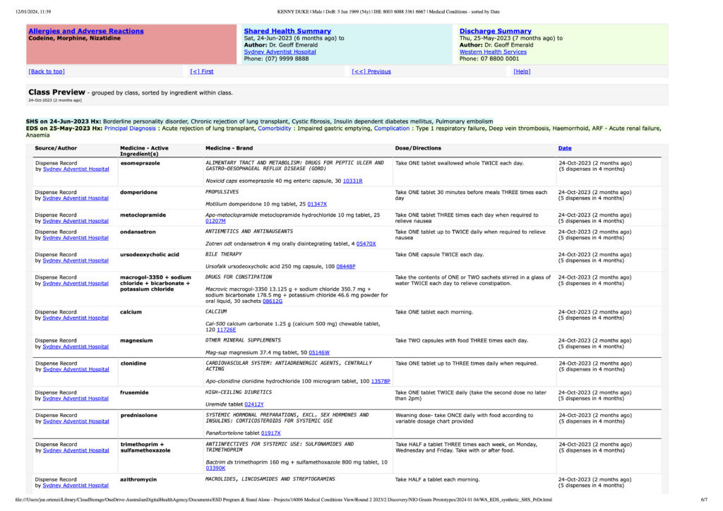
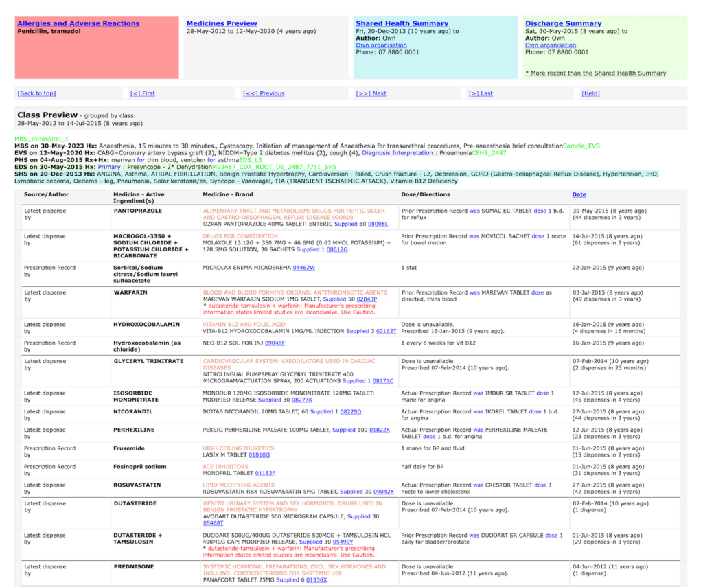
The final Practitioner View introduced a consolidated, clinician-oriented surface that brought together related clinical information while preserving the integrity and provenance of each underlying document.
Key solution elements included:
- Consolidated conditions landscape in a single scrollable view
- Fact-based grouping without diagnostic inference
- Progressive disclosure into source documents
- High-density layouts tuned for practitioner use
- A shared information model supporting both practitioner and patient experiences
This section is organised by class of medicine as defined by an international reference. It was thought it might be useful for clinicians but was rejected as too inferential by most clinicians in validation stages of the process.
Outcomes & Impact
The consolidated Practitioner View improved how clinicians could access, understand, and work with My Health Record information during consultations.
Outcomes included:
- Reduced cognitive and interaction overhead
- Faster orientation during consultations
- Improved confidence in information completeness
- Maintained clinical safety and governance
- A foundation for future patient-facing extensions
Learnings
- Clinical neutrality is as important as usability in health systems
- Density supports expert users when organised around their mental models
- Design-led sense-making reduces delivery risk
- Practitioner and patient interfaces must be distinct
- Meaningful improvements can be achieved without destabilising underlying systems
Related pages
Design-led delivery of a rebuilt management system in a regulated industry.
Web app to native MVP: Translating browser to iOS/Android
Back to all Case studies