
Transforming Clinical Data into Accessible Health Information
Client: Australian Digital Health Agency (ADHA)
Role: Lead Experience Designer
Award: 2023 Good Design Award
Overview
The Australian Digital Health Agency sought to improve engagement with My Health Record by launching a mobile app that made clinical health data more accessible to everyday Australians. I led the experience design effort to create a user-centred mobile experience that translated complex medical records into intuitive, plain-language health information – all within the constraints of existing APIs and infrastructure. I led the design process of the my health app from strategy through delivery to future feature scoping and roadmap workshops.
The Challenge
- Low engagement with the browser-based My Health Record due to technical language and poor usability.
- Users couldn’t find recent health data or understand clinical terminology.
- Development was constrained by legacy systems, existing APIs, and the need for clinical safety.
- High stakeholder visibility with expectations from government, product, and clinical teams.
My Role
- Defined the design strategy and led the end-to-end UX process
- Led internal and external stakeholder workshops, including product, system architects, and executive leadership
- Directed UI design, usability testing, and accessibility compliance
- Coordinated across design, development, product, and accessibility vendors
Design approach
Strategic Framework
- User Value – Prioritised plain language, findability, and timeline-based navigation
- Business Impact – Supported digital health adoption and long-term ecosystem goals
- Technical Feasibility – Designed within API limits, enabling scalable design for future enhancements

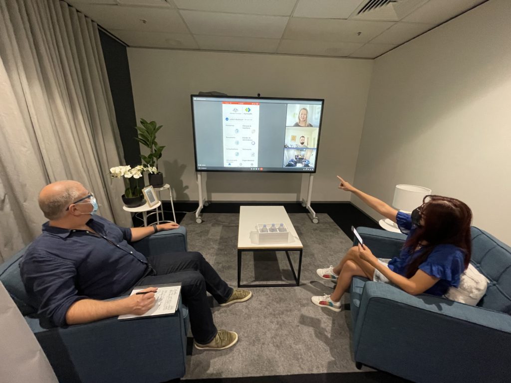
UX Research and testing
- Ran card-sorting and IA workshops with practitioners and consumers.
- Usability tests validated and guided all design decisions from early wireframes to beta builds.
- Partnered with accessibility experts and conducted inclusive testing across demographics.
Key design solutions
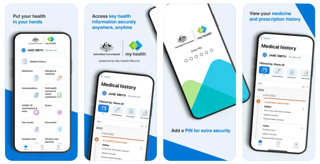
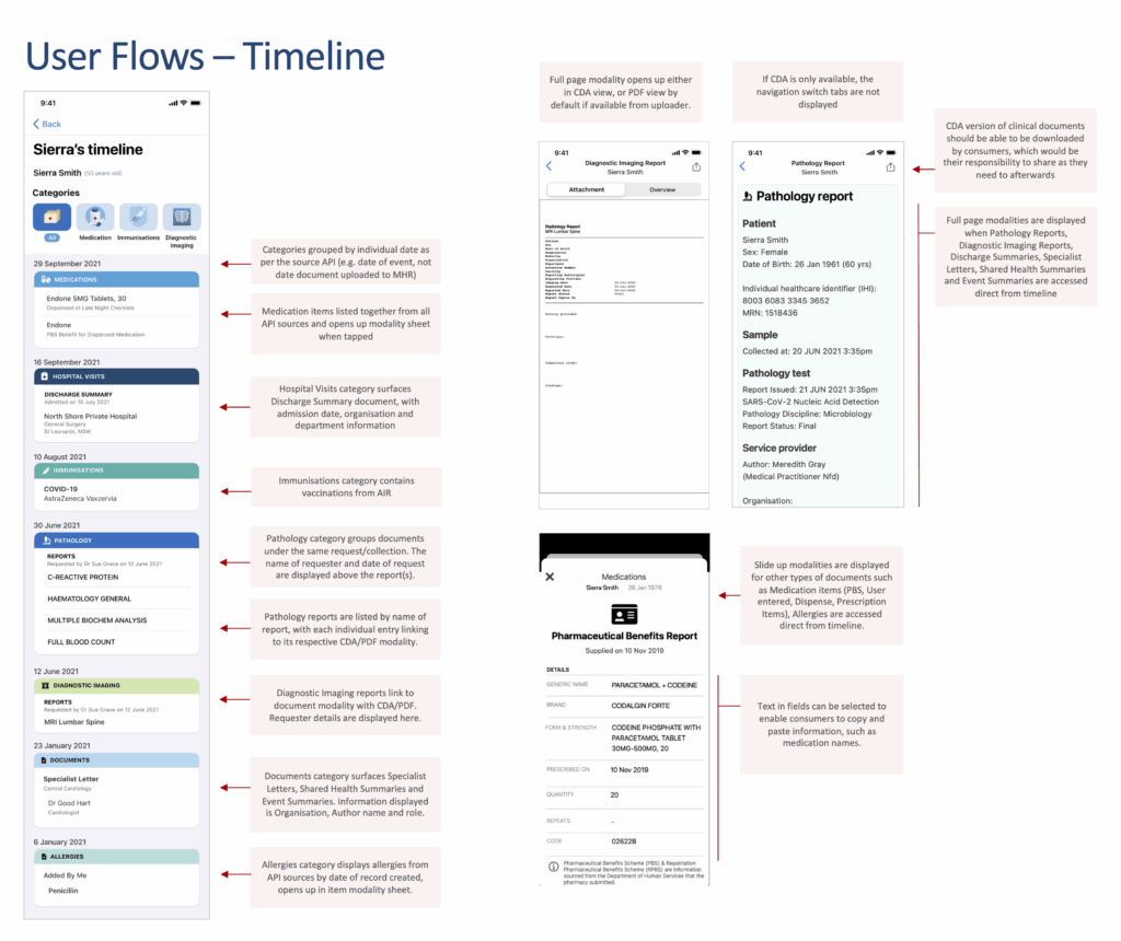
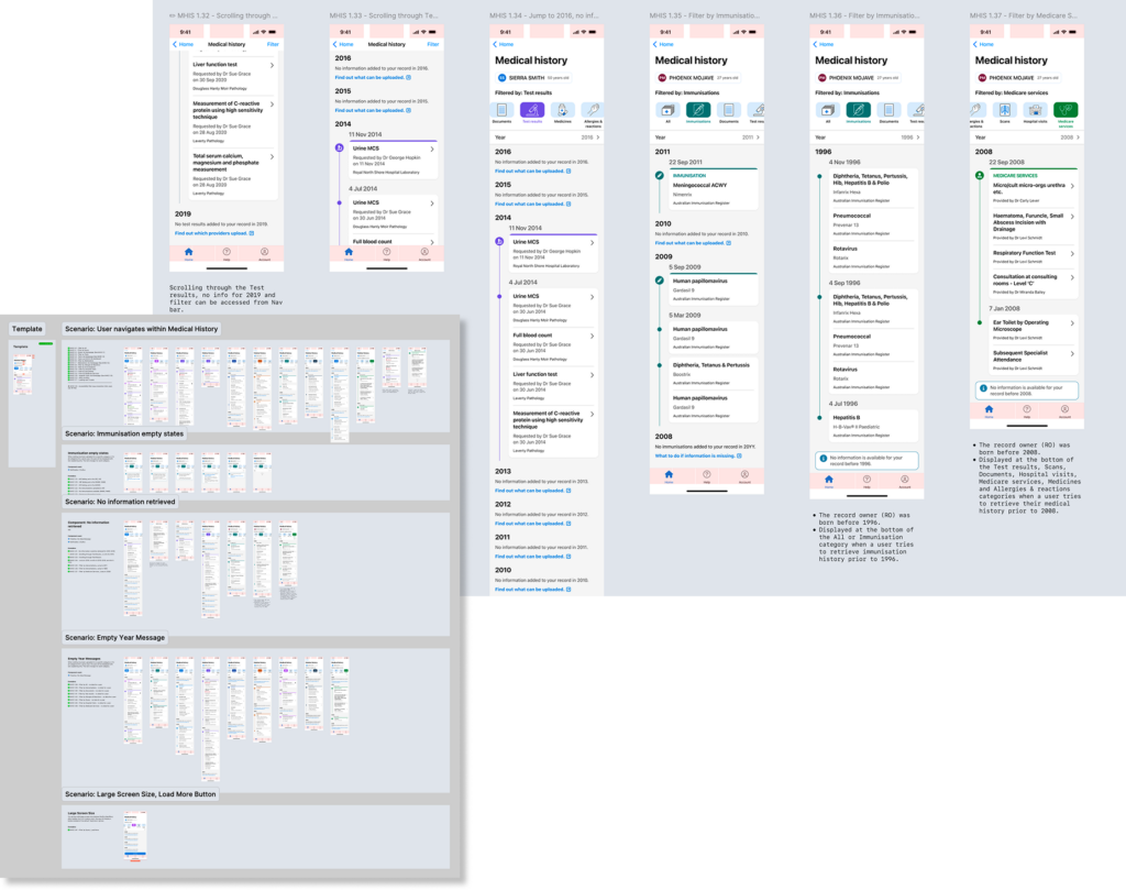
- Chronological health record timeline for easier data comprehension
- Plain-language taxonomy that improved understanding of navigation and terminology by 65%
- Category-based dashboard prioritising recent tests and medications, grouped how consumers wanted to see it
- “Show me” navigation to support users unfamiliar with medical terms
- Smoother navigation between individual people’s records, eg: allowing parents to traverse through child records easier
Delivery and outcomes
Delivery
- Released a working beta with real data integration
- regular usability testing through the development, as more sections were completed
- Developed detailed test plans, coordinated feature release and refinement
- Conducted post-launch workshops to prioritise a raft of next-phase features
- Detailed screen designs available for review on request
Impact
- 150,000+ registered users within the first year – without marketing nor promotion
- App contributed to elevated practitioner data contributions via user feedback
- Influenced the creation of a usability lab now adopted by other health products
- Recognised with a 2023 Good Design Award
- Leveraged new legislation to increase type and scope of records being aded to My Health Record
Challenges overcome
- Technical constraints: Delivered elegant UX within tight API and feature limitations
- Delayed timelines: Navigated a 4-month hold on public release without losing momentum
- High complexity: Balanced needs across clinical safety, citizen accessibility, and agency expectations
- Incomplete ecosystem: Advocated for app release coordination with broader campaigns to improve practitioner data uploads
Reflection
This project exemplified how strong design leadership, user advocacy, and strategic collaboration can deliver meaningful impact – even under technical and political constraints. It was a powerful example of how human-centred design can unlock engagement and trust from digital government services.
Related pages
Simplifying complexity of designing a greater density of information for clinicians.
Research and Discovery across a wide band of user cohorts
Back to all Case studies